Uncategorized
Importance of Font Choice
Fonts are wonderful tools. There is a tremendous amount of history, art, and science behind the characters we use and read on a daily basis.
With the appropriate font, you can reinforce - as well as refute - the message you are trying to impart. You've seen what I am referring too.
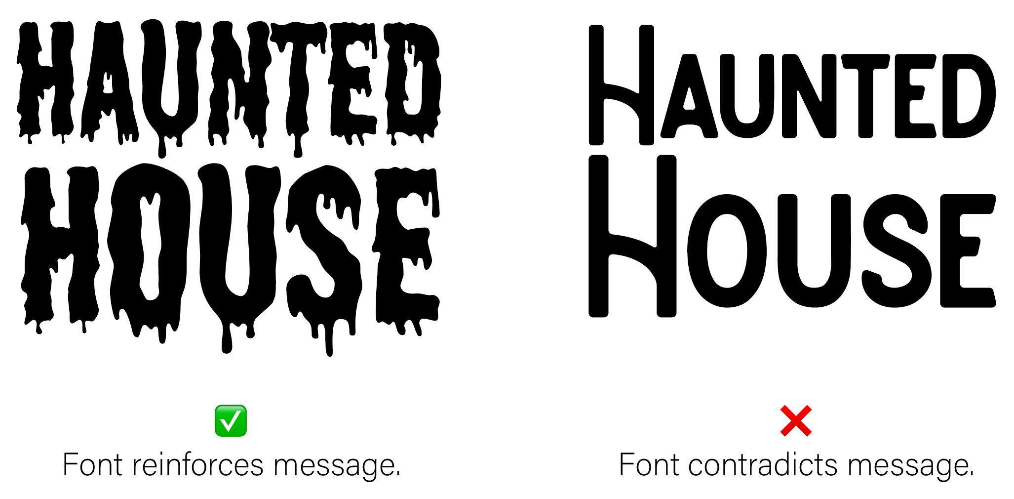
For example, a flyer advertising a haunted house would not likely want to use a light-hearted, bubbly, happy, font. Instead, you'd want to use something that would be associated with being scared or fear.

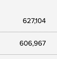
Recently, I caught some election results on a news outlet. This is a perfect example of a font choice. Visually, it appears that one candidate had fewer votes than the other.

This is an example of a variable-width font that shrinks the horizontal width of the numbers. It looks like the upper number is a 'smaller' number than the lower number. Even though the upper number is 20,137 votes more.
Every vote counts
This appearance is due to one number; specifically the '1'. With the digits that are used, they all, save the '1', use the full width of the character space. The '1', in this example is at most 1/2 the width of the other digits. As a result, when the numbers are stacked above each other, it appears as though the upper number is smaller than the lower.
How to fix this
Well, if you are going to present numbers stacked above each other like the picture above, make sure that you are using either a fixed-width font or one that appropriately accommodates the spacing that should be between the characters.
PS
Update 2020-12-09
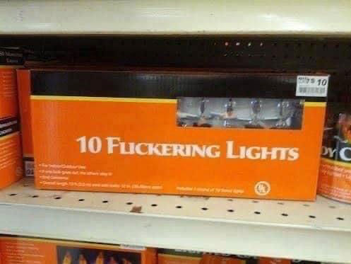
So, just happened to run across this picture in a social media feed. Yeah, font choice matters.

--Michael.


